Search This Blog

Tuesday, October 30, 2012

CEP 818: How Do I Love Thee: Abstracting

How do you abstract social injustice or inequality? Cartoonist often present current events related to social injustice or inequality in their work. For example:


Photographers often capture dramatic examples of social injustices or inequalities due to current or staged events:

 Peaceful Protesting Above.Typically in a peaceful protest, you don't see the participants being pepper sprayed. The officer was later reprimanded for his actions. In the photo, it is easy to see people holding up cell phones and recording the injustice.

 A depiction of a societal view that the poor suffer due to socially constructed economical differences between the rich (zombies) and the poor.

A depiction of a shopper walking by a poor man showing, once again, the gap between the "haves" and the "have nots." In this photo, I believe it is an abstract depiction of the subject matter because the viewer of this photo could "see" different things by observing. One might not necessarily only draw the conclusion of social inequality by looking at it. One may see it as -- a "problem" of homelessness in the urban areas. One could also see it as the two people in the photo not noticing each other because they are so different (gap).

In a previous module I also gave an example of social injustice in a poem (I Know Why the Caged Bird Sings). So how do I abstractly depict my subject matter differently in this module?


X marks the spot!! Considering that with abstracting and analogies we are looking at two topics that are seemingly unrelated (a treasure map and social inequality based on traits at birth i.e. gender, ethnicity, etc.) I thought about how much our birth traits effect our social position in life. In this treasure map, the X for the treasure is located on the map with a Caucasian male. Caucasian males have an advantage to other ethnicities and females of any ethnic background here in the United States. I wanted the student to see that by certain birth traits we are closer to success or at the very least access to certain things-education, health care, etc. That led me to creating the info graphic below:

rich_vs._poor title=
easel.ly
I created this infographic but I'm not sure it is actually "abstracting" the subject matter.  If you are able to look at the infographic and determine based on picture alone what it is I am depicting it is obvious.  However, the idea of an infographic to depict social disparities is not commonplace. Infographics are usually used to visually represent data.  While I didn't use actual data in the above infographic, I was illustrating the concept of the disparities visually. I intentionally made the graphics on the right (heart, building, house) somewhat opaque to illustrate that those things are less accessible to those that are "poor."

Much of our access to education, health care and "wealth" can be determined by where are born (developed or undeveloped nation), our gender, our "race", ethnicity, and the socio-economic status of our parents. Sure, we could achieve upward mobility-for women the easiest way to do so is by "marrying up".  However, I wanted to student to think about how if they had been born another gender, race, in a different place in the world---how much would their lives be different and would they have taken a different path?

Between the cartoons, photos, presentation and infographic I believe I have shown multiple representations of social inequality and/or social injustice. However, I do think there would be many other ways to abstract my topic and hope to develop more in the near future.

(All photos above were licensed by Creative Commons for resuse except for the infographic which I designed using easel.ly and of course the prezi that I created which used "pre-approved" prezi photos from Google Images ). 


Monday, October 22, 2012

Meaningful Play 2012

If you didn't get a chance to make it to MSU's Meaningful Play 2012-let me just tell you that it was amazing!!   You can find some of the material covered by discovering the hashtag #mp2012 in twitter. I was very inspired by the conference and excited about how the "serious game" industry is beginning to look at educational games in way that has never been done before. Two apps I ran across from the conference that I recommend are "Anatomy Browser" which is a simulation and "Virulent" which is a game about a virus that attacks the body. Both are free in the App Store and both are addictive!!

Friday, October 19, 2012

CEP 800 Digital Story Telling


Digital Story-Starry, Starry Night: Using Overlapping Waves Theory to Convey Perspective

Sunday, October 7, 2012

CEP 818: How Do I Love Thee: Patterning

The cognitive tool of patterning can assist in problem solving.By recognizing patterns in math, language, and even society-one can better "see" and understand the problem and potential solution(s). My original "problems" were based on the topics of social disparities like the education and health care gaps due to social status (ethnicity, gender, income, etc.)

Patterns in social equality or inequality through charts and graphs are very easy to find online. However, part of teaching social justice issues is connecting the data with the emotional side of the student. While I'm guessing many activists are "born" in current social problem classes, I think it is because the student is able to see the patterns in history on their own doing and not because of a stellar bar graph. How can I make these patterns real for them? Showing them this: 


My guess is not.  

I looked at patterns of injustice in America. One very clear “pattern” is social classes. In a class system, the social injustices are felt most in the impoverished populations as well as the minorities (sometimes overlapping).

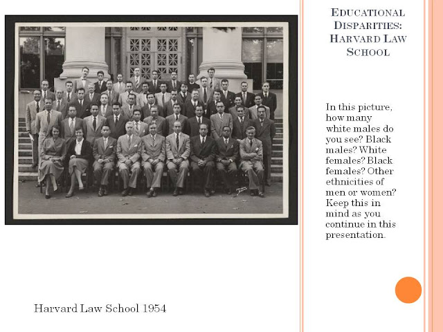
After reviewing the educational disparities among men and women and ethnic minorities, it hit me. I thought about graduating class photos. I found on Harvard’s website that they had law school graduating class photos all the way back to the late 1800’s. Seeing the people and being able to recognize their race and gender while they are all in a pattern (in rows lined up) would be a great way to illustrate the disparities in education.


To make the patterns connect for them, I believe it is necessary to use examples that have a human connection. What better way to connect than with photos of actual humans? 


Visually, these photos represent the statistics regarding these disparities over time. It is obvious that Harvard (like many other colleges) had mostly male Caucasian/white graduates for years. I had put these photos into a powerpoint presentation and purposefully kept the side bar language in each slide the same. Because the issue doesn't change over time-only the pattern of outcomes.

Initially, this activity seemed very daunting to me.  However, I did explore patterning from numerous viewpoints which helped me to have a much better understanding of the tool itself. I ventured to other students blogs, read various sociological perspectives on disparity patterns over time, and paid much closer attention to the creative ways that academics were presenting their information. Most of the "white papers" I read involved charts and graphs and some had no visual representation whatsoever of their topic. I can see where presenting this type of subject matter utilizing patterning would be very beneficial to many students and help inspire them to present their information creatively as well.